Accessibility & Dyslexic-Centered Design at Very Bad Agency
UX/UI Designer exploring the edges of digital clarity and creativity. Co-founder of Very Bad Agency – Digital Pharmacy, where bold ideas meet honest design. I write about interface thinking, creative process, and building brands that actually mean something. Currently exploring new ways to communicate visually — through motion, interaction, and unconventional design methods.
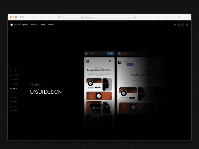
At Very Bad Agency, accessibility is not an afterthought — it is part of the design system.
Our website is intentionally designed to support users with dyslexia and cognitive processing differences, while remaining clean, modern, and visually strong.
Design Centered, Not Overloaded
The entire experience is design-centered and minimal by intent.
We actively avoid cognitive overload by reducing unnecessary visual noise, excessive text, and complex interaction patterns. Every element on the page has a clear purpose.
No cluttered layouts
No competing visual hierarchies
No decorative distractions disguised as “creativity”
Typography Built for Readability
Typography on verybad.agency is optimized for readability first:
Clear, modern sans-serif typography
Generous spacing between lines and sections
Predictable text structure and hierarchy
Short, scannable text blocks instead of dense paragraphs
The goal is simple: text should be read, not decoded.
High Contrast for Visual Comfort
We use a black background with white text deliberately — not as a trend, but as a usability decision.
Strong contrast improves letter recognition
Reduces visual fatigue
Helps users maintain focus while reading
This contrast supports dyslexic users and benefits everyone, especially during long or repeated visits.
Motion Without Cognitive Load
Animation is used with restraint and intention.
Our motion design:
Focuses on showing services, not distracting from content
Avoids rapid, looping, or chaotic motion
Keeps transitions predictable and purposeful
To maintain orientation and reduce cognitive strain:
Section headers remain consistent across animated service blocks
Users always know where they are and what they are viewing
Motion enhances understanding — it never competes with it.
Accessibility Is Functional, Not Cosmetic
We do not rely on “accessibility overlays” or surface-level fixes.
Instead, accessibility is embedded into:
Layout logic
Content structure
Visual hierarchy
Interaction flow
This approach aligns with WCAG principles and modern UX laws focused on clarity, consistency, and cognitive load reduction.
Designed for Real Humans
Dyslexic-centered design improves usability for:
Users with dyslexia
Users with ADHD or cognitive fatigue
Non-native language readers
Anyone navigating content quickly or under pressure
Inclusive design is not niche — it’s better design.